What drives ageing millionaires to spending a lifetimes hard work on a hurtling historical time capsule?
The simple fact that classic cars are sexy, and sex sells.
I recently had the pleasure of watching the horde of retired accounts risk life and limb around one of the most beautiful race tracks in the world, Lindsay Fox’s Phillip Island Circuit. What drew my eye? Who branded these sexy autos? What’s the history? Updated automobile logos usually coincide with a chorus of criticism but how much does the branding and visual identity have to do with sales? Everything. Because perception is everything. A badly badged, frumpy logotype on the tip of your latest state of the art sports car is commercial suicide. When buying a car people think of practical things: is it good for the environment? Can I fit my mountain bike, picnic rug and Bocce set inside? Is it safer than the other one? The list is endless… But what I saw at the race reinforces a simple fact that if it’s smart and well-designed it sells.
Let’s have a look at some few highlights.


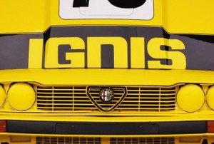
Alfa Romero identifies itself with medieval heraldry and sans serif type. It displays class all over the car from the hand scripted type (pictured) to custom pedals with etched logo (also pictured). Alfa’s badge is a great mix from emblems from fifteenth century Italy. Originally designed by Romano Cattaneo, it incorporated two traditional Milano heralds: on the right, the Biscione, of the House Visconti; on the left, (looking suspiciously like the English flag), is the emblem of the city of Milan. The badge was revised when the company was purchased by Nicola Romeo, a strong blue ring was added with traditional Savoy dynasty knots to honour the Kingdom of Italy. This link to history is still relevant and powerful today, it makes the car a part of the Italian national fabric. The local market identifies with this nationalism, increasing sales at home, however it is more successful internationally. Italian cars have a reputation and racing heritage that has translated into a undeniable fashion icon. The idea of having a Italian sports car is a sexy one. It is something that certain people strive for, and once they have one they are in an elite group, one that Kia motorists observe with awe from the outside. To quote HBO’s Entourage
Drama: I had an Italian sports car in ’94. They’re a delight.
Turtle: You had a Fiat, Drama
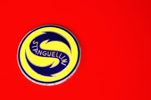
Another great but lesser known classic Italian sports car manufacturer is Stanguellini. These sportscars, made between 1946 – 1960, feel and seem like ground hugging rockets. The logo (pictured) is a serpentine, doubled headed, superman S, with a hint of eel. When drafting the symbol they only had to worry about pleasing the factory owner, not a international multi-media platform advertising campaign. You can imagine the brand’s progress from this beginning through recent design history. A classy drop shadow in the 80s, maybe a strong type focus during the 90s and a simple, understated re-imagining in 2009. Did Stanguellini’s ‘fresh modern look’ connect with its market? Is it a good idea to update a badge when industry cornerstones such as Ford and Ferrari haven’t?


For me the unexpected is the appealing. Alvis, which started as a stationary engine and carburettor body manufacturer inspired by the mythical Norse weaponsmith of the same name, won classic car fans for its vintage 1920s race cars. During the growth from body manufacturer to sports car market leader Alvis changed its badge, after complaints from Avro Aviation company, from winged green triangle to the red inverted triangle (pictured). This unremarkable logo was eclipsed by the great figures that Alvis continually used on the tip of the hood. This tradition taken from naval history is executed well with Alvis’ famous Silver Eagle Mascot, beautifully sleek and cutting through the air. Alvis wasn’t afraid to stray away from the Silver Eagle however, when I stumbled across this stoically perched rabbit (pictued above) I lamented a tradition that has fallen by the wayside. Sleek modernism has gone away with the mascot and I look forward to the day when the new Jaguar sports a newly designed silver mascot that adds to the visual appeal of the auto. If Alvis continued to grow with the likes of British contemporaries Aston Martin and Jaguar where would have they taken this unremarkable branding?
Automobile branding has moved way beyond how the badge sits on the hood. While Ferrari sells its cars to a very exclusive customer base, it still manages to sell millions of dollars of t-shirts on the strength of their brand alone. The famous prancing pony represents a red pride to thousands and their smart lettering cut from steel is sought after across the world. Is this the design Golden Goose? The ultimate brief? A symbol that is worshipped, adored and loathed.
No comments:
Post a Comment